Color Grading for Beginners Enhancing the Visual Style of Your Videos

Color Grading for Documentary Series or Film
Your approach to color grading for documentary series or film in the post-production process significantly affects the end result for your audience.
Color grading is a crucial part of the post-production process in documentary series that helps enhance the visual consistency and storytelling across multiple episodes or feature film length.
By manipulating the colors and tones of the footage, color grading allows filmmakers to set the mood, evoke emotions, and guide the audiences perception.
Effective color grading techniques are essential for maintaining visual consistency and enhancing the storytelling experience in documentary series.
Creating a style guide is crucial for maintaining visual consistency in a documentary series by defining a color palette, establishing treatment guidelines, and documenting technical specifications.
By creating a style guide, matching color across episodes, and utilizing appropriate tools, filmmakers can successfully create a cohesive and impactful visual narrative.
Reasons to Use Color Grading for Documentaries
Whether youre a high school student making their first documentary, a practitioner in the observational documentary filmmaking movement or an established documentary filmmaker such as Ken Burns or Michael Moore, color grading will make or break your production.
Establishing a Visual Identity
Color grading helps in creating a unique visual style for the documentary series, giving it a distinct look and feel. It allows the filmmakers to reinforce their storytelling by using specific color palettes that align with the subject matter and overall theme of the series.
Enhancing Emotional Impact
Colors have the power to evoke certain emotions in viewers. By strategically applying color grading techniques, filmmakers can intensify the emotional impact of the documentary series, eliciting empathy, tension, or tranquility depending on the desired effect.
Creating Visual Continuity
Documentary series often span across multiple episodes, and maintaining visual consistency is crucial. Color grading ensures that each episode flows seamlessly, creating a cohesive visual experience for the audience.
Color Grading Techniques for Documentaries
1. Establishing a Color Palette: Begin by defining a color palette that reflects the tone and atmosphere of the documentary series. This involves selecting specific hues, saturation levels, and contrasts that convey the desired mood and reinforce the narrative. Consistency in the color palette helps establish a recognizable visual identity throughout the series.
2. Using Color to Enhance Storytelling: Colors can communicate information and convey meaning. Employ color grading techniques to guide the audiences attention, highlight important elements, or differentiate between different narratives or timeframes within the series.
3. Adjusting Color for Different Scenes: Documentaries often include a variety of settings, from bright outdoor locations to dimly lit interiors. Adjusting the color grading for each scene is vital to maintain visual coherence. Use tools like color temperature, exposure, and color balance adjustments to ensure a seamless transition between different environments and lighting conditions.
Color Grading Tools for Documentaries
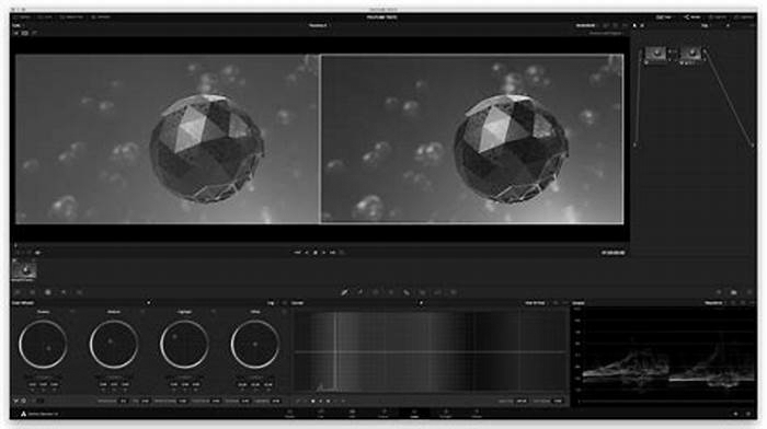
1. Color Grading Software: Professional color grading software like DaVinci Resolve, Adobe Premiere Pro, or Final Cut Pro X offer a wide array of tools and features to enhance the colors and tones of the footage. These software solutions provide advanced color grading controls, including color wheels, curves, and scopes, enabling precise adjustments to achieve the desired look.
2. Adjusting Color With LUTs: Look-Up Tables (LUTs) are pre-defined color adjustments. LUTs are especially useful for maintaining consistency across episodes and achieving a desired artistic style. They streamline the color grading workflow and save time by providing instant visual effects.
How to Color Grade a Documentary
In this video, watch as a documtary is color coded with DaVinci Resolve 16.
Topics include:
- Overcoming Challenges: Conquer obstacles to create a cool look with film emulation, replicating the structure of the documentary while making necessary changes.
- The Power of Rewarding Tasks: Learn how breaking down challenging shots with more manageable ones can keep you motivated and provide instant gratification.
- Mental Stamina in Color Grading: Gain insights into the colorists role, where small changes can have a significant impact, and how mental stamina is crucial when dealing with perception shifts.
- Tips for Editing Projects: Whether you work professionally or on personal projects with editing software like Final Cut 10 or Premiere Pro, the valuable tips apply to all.
- The Art of Conforming: Dive into the bacon blade and the round-tripping process through the conform module. Discover the powerful collaboration between different cameras color sciences.
- Attention to Details: Find out how our speaker utilized the lightbox mode to focus on specific details, providing the much-needed reference points to handle challenging shots effectively.
How to Color Grade a Documentary | DaVinci Resolve 16 Tutorial Waqas Qazi on YouTube
Key topic include:
- Introducing the concept of color grading in a documentary
- Using scopes and evaluating the overall image
- Reviewing each scene for its own voice and flow
- Feeling out the project to enhance the storytelling
- Creating a cool look with film emulation
- Importance of replicating structure and making necessary changes
- Comparison of cameras and mention of Blackmagic, Red, and Alexa
- Extra damage control required for a project
- Discussion of a challenging shot at the beginning and advice on tackling difficult tasks
- Mental stamina and its significance for colorists and professionals using editing software
- Explanation of the post workflow and the bacon blade process
- Conform module and bake and blade process in round tripping
- Requesting clean exports and specific export format
- Challenges of capturing clouds and providing reference points for difficult shots
- Example of turning a challenging shot into a silhouette
- Adjusting offset, left gamma, and gain control for contrast and clarity
- Making individual changes despite making life difficult
- Placement of whites and previous shots
- Importance of referencing and using the lightbox mode
- Utilizing the eye icon for additional information
- Enhancing impact and keeping highlights crisp and sharp
- Importance of constantly processing elements at a high level
- Caution against forgetting techniques and experiencing tunnel vision.
Create a Style Guide
A style guide is an essential tool for maintaining visual consistency throughout a documentary series. It provides a set of guidelines and references for color grading, ensuring that the tone and mood of each episode align with the overall narrative. Here are some key elements to consider when creating a style guide:
1. Define the Color Palette:
Start by selecting a primary color palette that complements the documentary series content and theme. This could be based on the genre, location, or emotional tone.
Choose colors that evoke the desired emotions or convey the intended message. For example, warm tones may create a sense of intimacy, while cool tones can evoke a more detached or objective atmosphere.
2. Establish Treatment Guidelines:
Determine the desired look and feel for the documentary series. This could include factors such as contrast, saturation, brightness, and overall color balance.
Develop guidelines for specific scenes or scenarios, such as interviews, outdoor shots, or archival footage. Consider how color grading can enhance the storytelling and evoke the desired emotions in each context.
3. Document Technical Specifications:
Specify the technical aspect of color grading, such as color space, bit depth, and resolution, which ensures consistent output across all episodes.
Address any technical considerations related to the intended distribution platforms, such as streaming services or broadcast requirements.
Matching Color Across Episodes
Consistency in color grading is crucial for ensuring a seamless viewing experience in documentary series. When it comes to matching color across episodes, there are several key considerations to keep in mind:
1. Establish a reference frame: Before diving into the color grading process, its essential to establish a reference frame or style guide. This will serve as a visual guideline and help maintain consistency throughout the entire series. The reference frame should include specific instructions on color temperature, saturation, contrast, and any other stylistic choices relevant to the series.
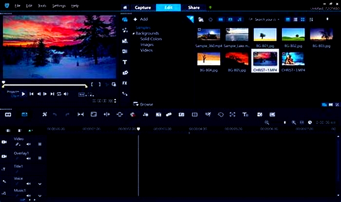
2. Use color grading software: Color grading software, such as Adobe Premiere Pro or DaVinci Resolve, can be incredibly valuable in achieving consistent color across episodes. These tools provide features like adjustment layers, masks, and curves that allow you to fine-tune the color grading for individual scenes or shots. By applying the same settings consistently, you can create a cohesive look across multiple episodes.
3. Communicate with the colorist: If youre working with a professional colorist, effective communication is key. Clearly convey your desired color palette and style guide to ensure the colorist understands your vision. Collaborate closely throughout the color grading process and provide feedback on each episode to maintain consistency. Regular communication can help address any discrepancies and ensure that the color grading aligns with the overarching storytelling goals.
4. Regularly check color consistency: As the documentary series progresses, its important to periodically review the color grading of each episode. This will allow you to identify any discrepancies or inconsistencies that may have arisen during the editing process. By regularly checking color consistency, you can address any issues promptly and make necessary adjustments to maintain a seamless viewing experience for your audience.
More for Filmmakers
Color Grading 101: The Key to Enhancing Your Videos' Visual Appeal
As a video production professional with over two decades of experience, I have learned that color grading plays a pivotal role in shaping the visual appeal of any video. Coming up through the industry the old-fashioned way, I've gained invaluable insights into the world of color grading, and I am eager to share them with you. In this article, we will explore the basics of color grading, its impact on the overall look of a video, and how mastering this skill can set you apart as a thought leader in video editing.
What is color grading?
Color grading is the process of adjusting the colors, tones, and contrasts in a video to create a specific look and feel. This process is typically performed during post-production using specialized software like DaVinci Resolve, Adobe Premiere Pro, or Final Cut Pro. Color grading allows video editors to enhance the visual appeal of their footage, ensuring that the final product aligns with the creative vision of the project.
The impact of color grading on a video's visual appeal
Effective color grading can significantly impact the overall look and feel of a video, adding depth, emotion, and atmosphere to the footage. By adjusting the color balance, saturation, and contrast, you can create various moods and evoke different emotions, giving your video a unique and captivating look. Color grading can also help to:
- Correct for inconsistencies in color and exposure due to varying lighting conditions or camera settings
- Match the look of shots taken with different cameras or lenses
- Create a consistent visual style that aligns with the project's creative direction
Mastering color grading as a thought leader in video editing
As a video editor or post-production team lead, mastering color grading is essential to stand out in a competitive market. By developing a deep understanding of color theory, the technical aspects of color correction, and the creative use of color grading tools, you can elevate your skills and become a sought-after expert in your field. Some tips to get started with color grading include:
- Study color theory: Understanding color theory is crucial for making informed decisions during the grading process. Familiarize yourself with color wheels, complementary colors, and the psychological impact of various color combinations.
- Learn the software: Invest time in learning the ins and outs of color grading software. Tutorials, online courses, and workshops can help you become proficient in using these tools.
- Develop your creative eye: As with any artistic endeavor, developing a keen eye for color and style takes time and practice. Analyze the color grading in your favorite films and commercials, and experiment with different looks in your projects.
- Network with industry professionals: Connecting with other video editors and colorists can help you stay updated on the latest trends and techniques. Attend workshops, conferences, and online forums to expand your knowledge and network.
Color grading is an essential skill for video editors and post-production professionals, and mastering it can set you apart as a thought leader in the industry. By understanding the fundamentals of color grading, its impact on video's visual appeal, and dedicating time to learning and practicing the craft, you can elevate your video editing skills and create stunning, visually captivating content.
As an experienced video production professional with a strong background in color grading, I can help you bring your projects to life with captivating visuals that tell your story in a powerful and engaging way. If you're looking for a video production expert or a post-production team lead, don't hesitate to reach out. Together, we can create exceptional content that resonates with your audience and achieves your creative vision.


